Table of contents
Your theme isn't broken — you just have too many columns. Every plugin you add can drop another one onto the Posts screen, and eventually there's no room left for the title. Click Screen Options in the top right, untick the ones you never actually look at, click Apply, and your titles come back.
You open Posts to find the article you wrote last week, and the titles have vanished. In their place is a thin ribbon of single letters trickling down the page, one row taking up the whole screen.
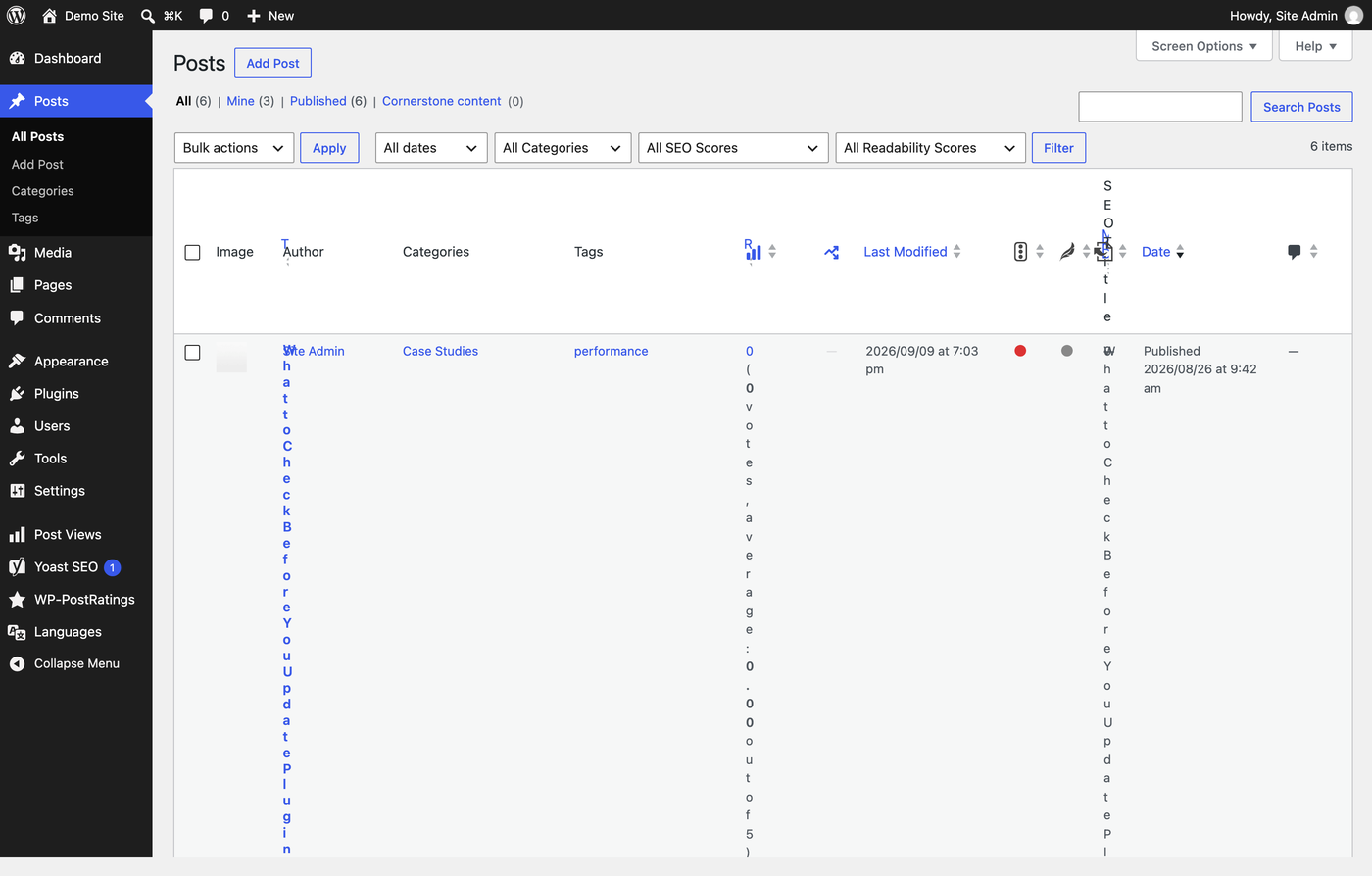
It looks like something has gone badly wrong. Nothing has. This is just what WordPress does when it runs out of room.
Why this happens
WordPress splits the width of the screen between every column on the table, and it keeps splitting no matter how many turn up. The title doesn't get any special treatment or a minimum width — it simply takes whatever is left over. Squeeze it far enough and each word has to wrap onto its own line. Squeeze it further and each letter does.
So where did all those columns come from? Mostly from your plugins. Here's what was switched on for the screenshot above:
| Plugin | What it adds to the Posts screen |
|---|---|
| Yoast SEO | SEO score, Readability score, SEO Title, Meta Desc., Keyphrase, Outgoing internal links |
| Post Views Counter | Post Views, Traffic Signals |
| WP Last Modified Info | Last Modified |
| WP-PostRatings | Ratings |
| Featured Image Column | Image |
That's eleven columns from five plugins, on top of the Author, Categories, Tags, Date and Comments columns that WordPress offers by default. None of those plugins is misbehaving. They all just showed up to the same small table.
And that's the good news, because it means you don't have to uninstall anything. You just have to tell WordPress which ones you actually want to look at.
How to fix it
Head to Posts in the sidebar. Now look at the very top right of the page, above the "Posts" heading and next to Help — there's a tab called Screen Options. Click it.
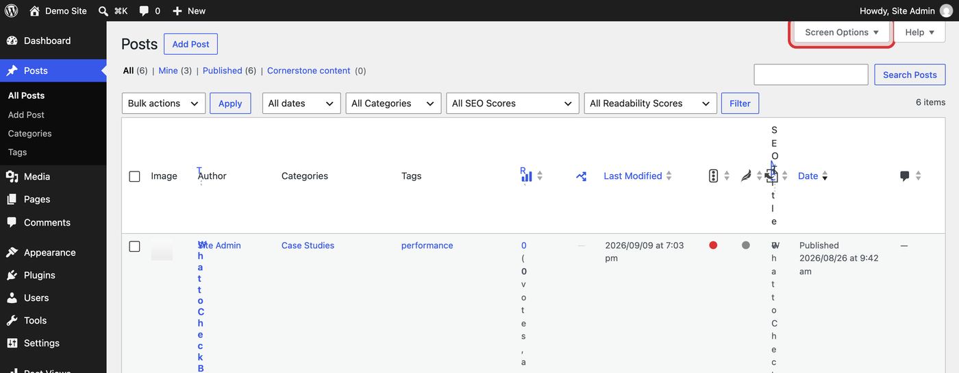
It's easy to have used WordPress for years without noticing this tab, because it sits above the page rather than inside it.
A panel slides down from the top of the page. The first thing in it is a row of checkboxes labelled Columns — one for every column that's allowed on this screen, including all the ones your plugins added.
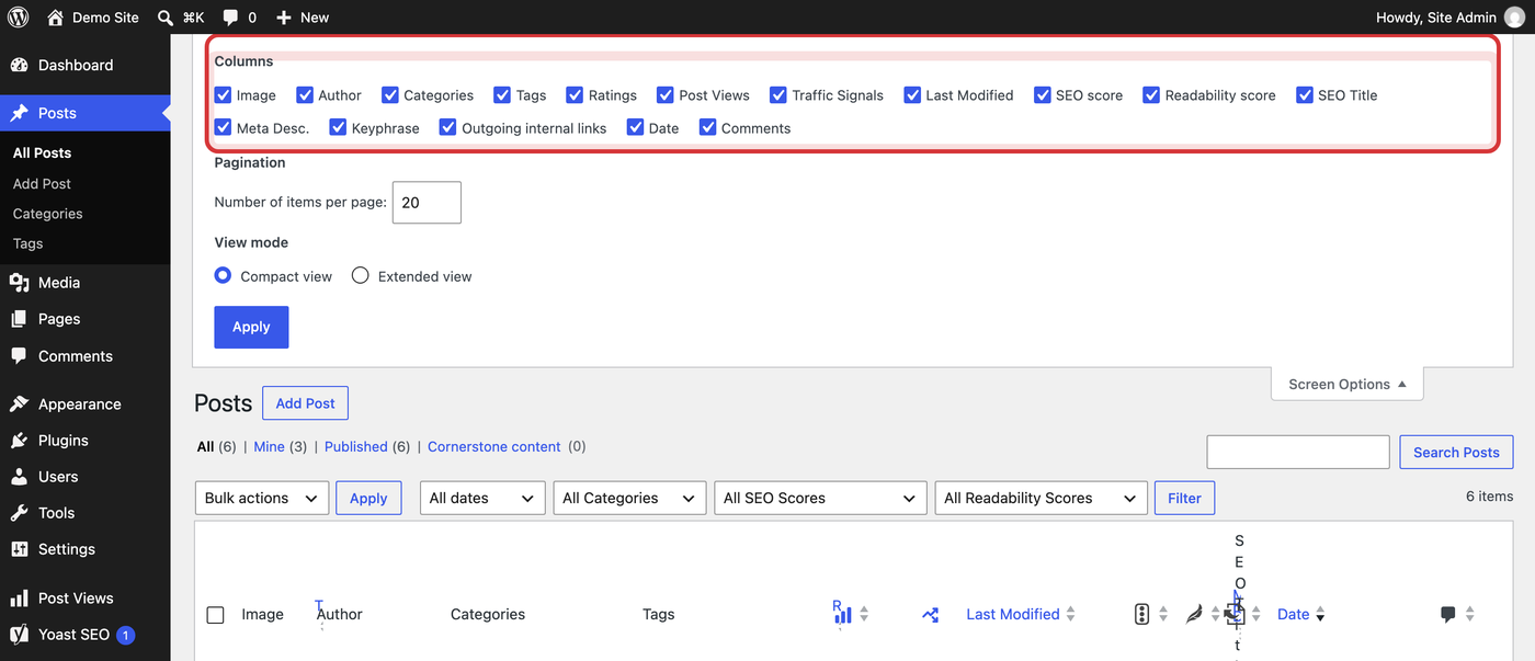
Every ticked box is another slice taken out of your titles.
Go through and clear the ones you never read. The column disappears from the table straight away, so you can see the effect before you commit to anything. When it looks right, click the blue Apply button.
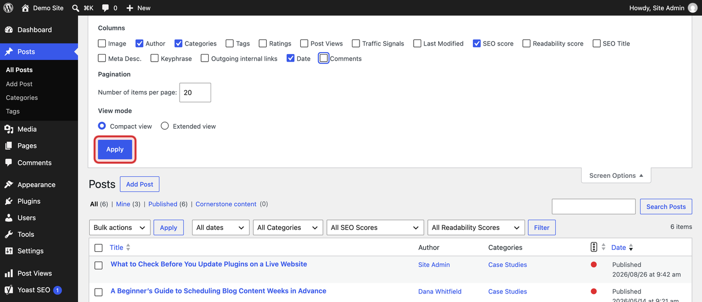
Here everything's gone except Author, Categories and Date.
The page reloads, the columns you kept share out all that reclaimed space, and your titles go back to being titles.
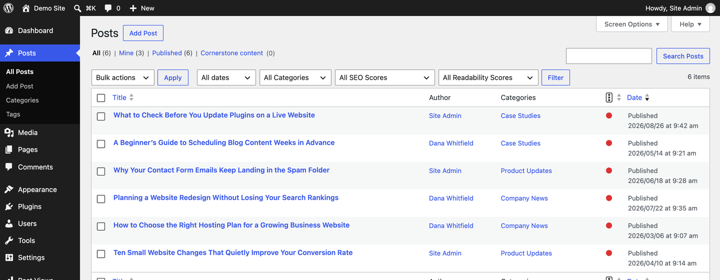
Same six posts, same browser window, same plugins still switched on. The only thing that changed is what you asked WordPress to show you.
Which columns are worth keeping?
There's no right answer, but here's a sensible starting point:
- Keep Date. It's how you find "the one from last Tuesday", and it's narrow enough not to hurt.
- Keep Author only if more than one person writes on your site. If it's just you, every row saying your name isn't telling you much.
- Keep Categories if you file things properly. Tags are usually the first thing to go, because tag lists get long and wrap messily.
- Turn off the SEO columns while you're browsing. You read those scores in the editor, where the actual advice is, not from a list.
- Turn off anything you never sort by. View counts, star ratings and last-modified dates are reporting. Go and look at them when you want a report.
You can always change your mind later, so don't agonise over it.
A few things worth knowing
- It's your setting, not the site's. Screen Options saves against your login, so it follows you to any computer you sign in from, and nobody else's screen changes. The flip side: if a colleague is staring at the same mess, they'll have to do this on their own login.
- Every list has its own. Pages, Media, Comments, Users, products and anything else with a list has its own Screen Options tab. Fix them as you come across them.
- Nothing gets deleted. Hidden is just hidden. Tick the box again and everything's still there.
- Compact view keeps rows short. In the same panel there's a View mode choice. Extended view adds a preview of the post underneath every title, which is lovely for reading and terrible for scanning. Compact is usually what you want.
- Squeeze out a bit more room. The Collapse menu button at the very bottom of the sidebar shrinks it to a strip of icons and hands that width back to your table.
Hiding it one login at a time gets old fast. Check the plugin's own settings first — plenty of them have a switch to stop adding the column at all. Failing that, it's a small job for whoever looks after your site.
The Posts screen is one of the places you'll spend the most time in WordPress, so it's worth a minute to make it pleasant. If you're still finding your way around the rest of it, our guide to the WordPress dashboard walks through every menu in the sidebar.

Leave a comment