Table of contents
The Columns block is how you put content side by side in WordPress — feature lists, image-and-text pairs, pricing comparisons — without touching a page builder or CSS.
We re-shot this tutorial from scratch in August 2026 on WordPress 7.0; the screenshots below are exactly what the current editor shows.
- Insert the Columns block and pick a layout (50/50, 33/66, three columns…).
- Click the + inside each column to add any block to it.
- Column widths live in the Settings sidebar with the column selected.
- Leave Stack on mobile on so the layout collapses gracefully on phones.
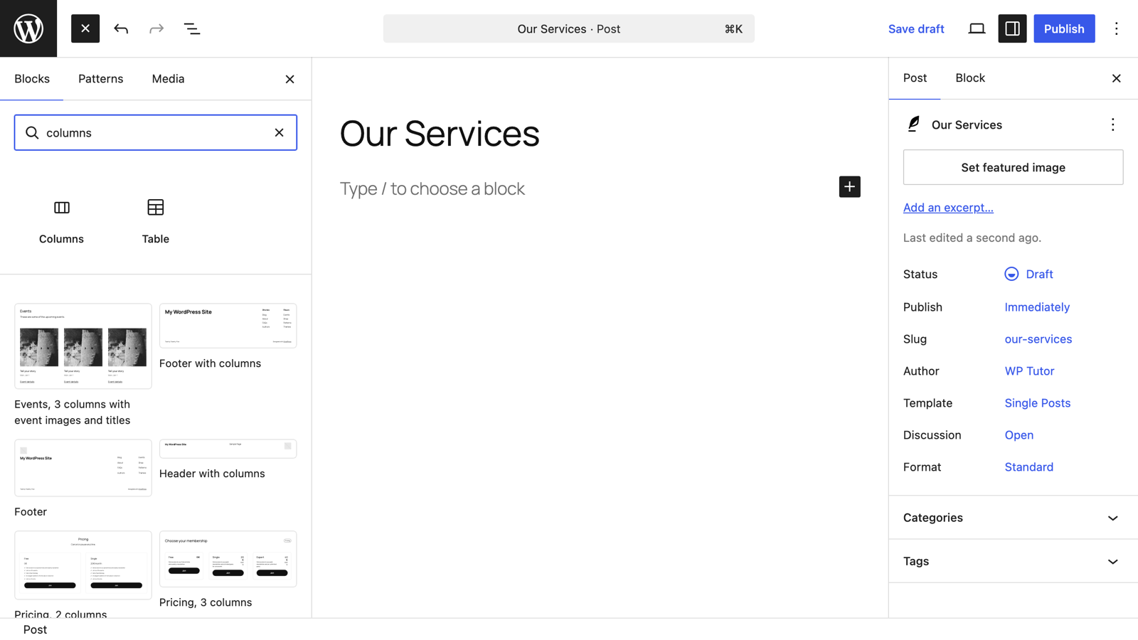
In the post or page editor, click the blue + in the top-left corner and search for columns. Click the Columns block to insert it.
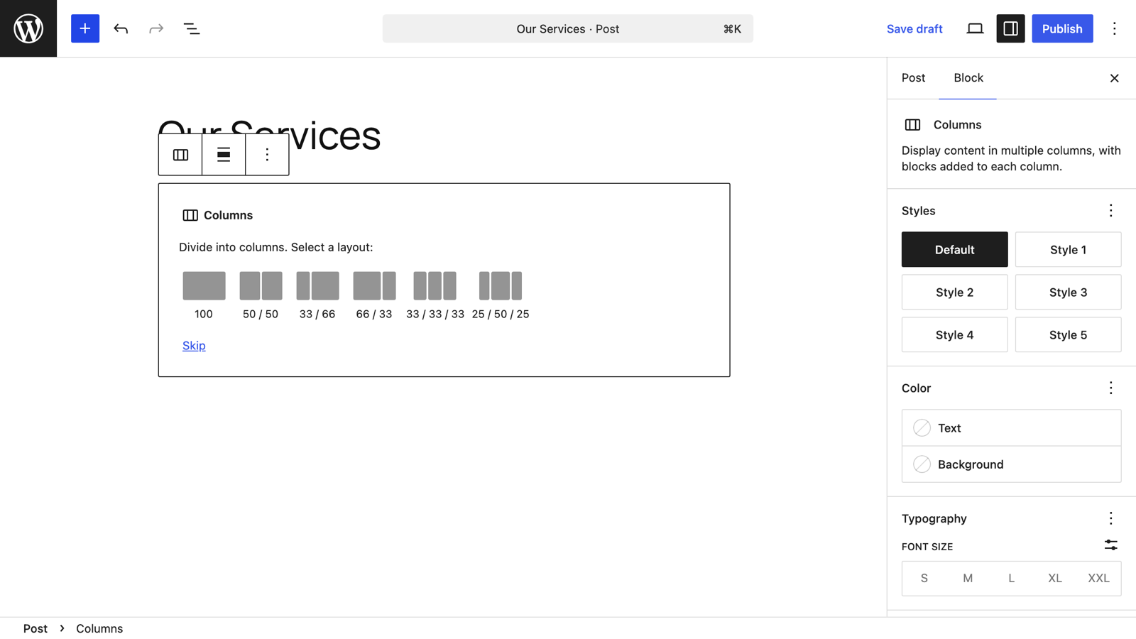
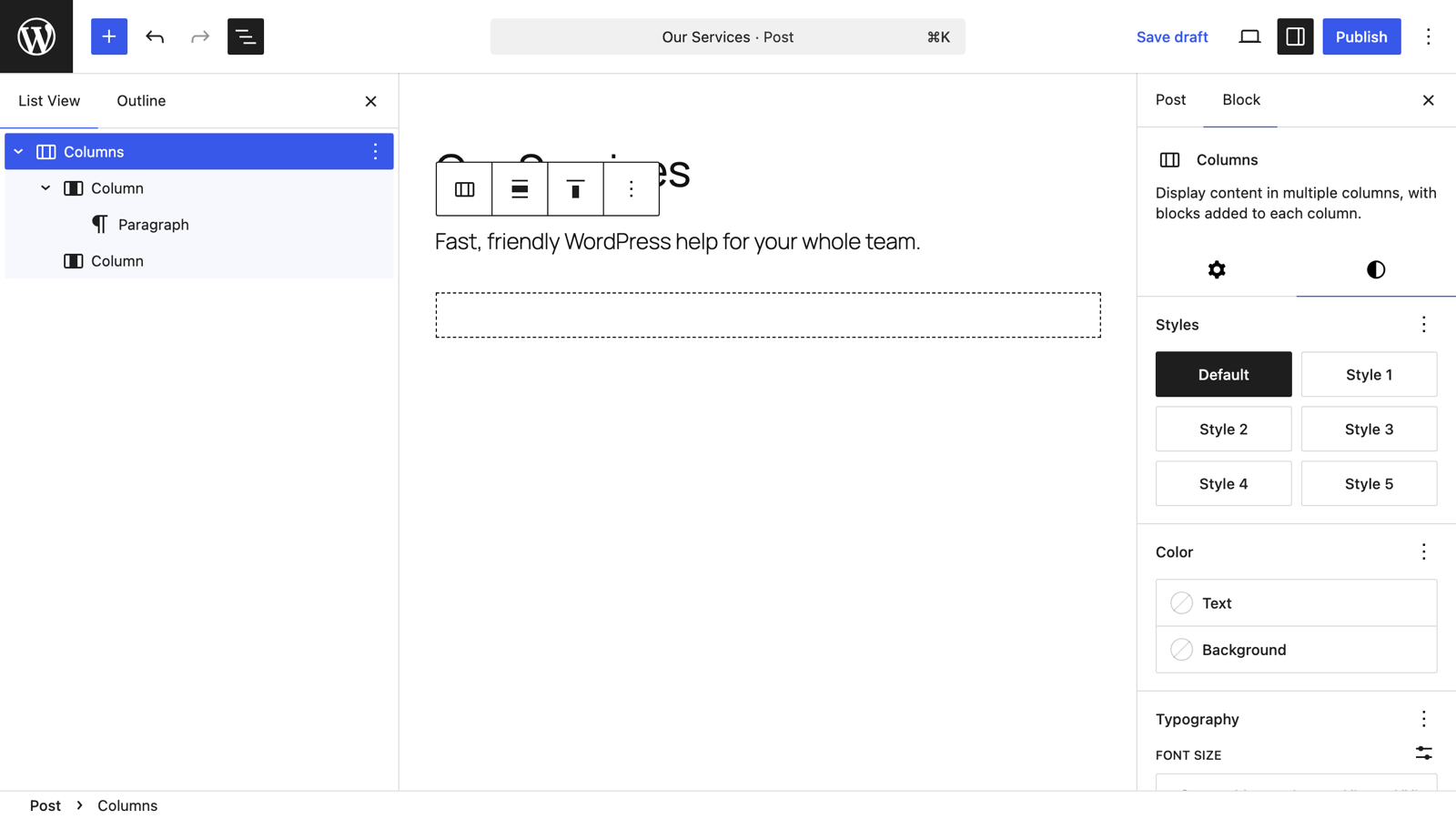
The block first asks you to "Divide into columns. Select a layout" — equal halves (50/50), a sidebar-style 33/66 or 66/33 split, three equal columns, and more. Click one to start with it; you can change everything later. (Your theme may also offer ready-made styles for the block in the sidebar, like the Style presets you can see here in Twenty Twenty-Five.)
Each empty column shows a + button. Click it, choose a block — a paragraph, image, heading, button, anything — and fill it in. Repeat for the other column(s). Here's a two-column layout with a paragraph in each:
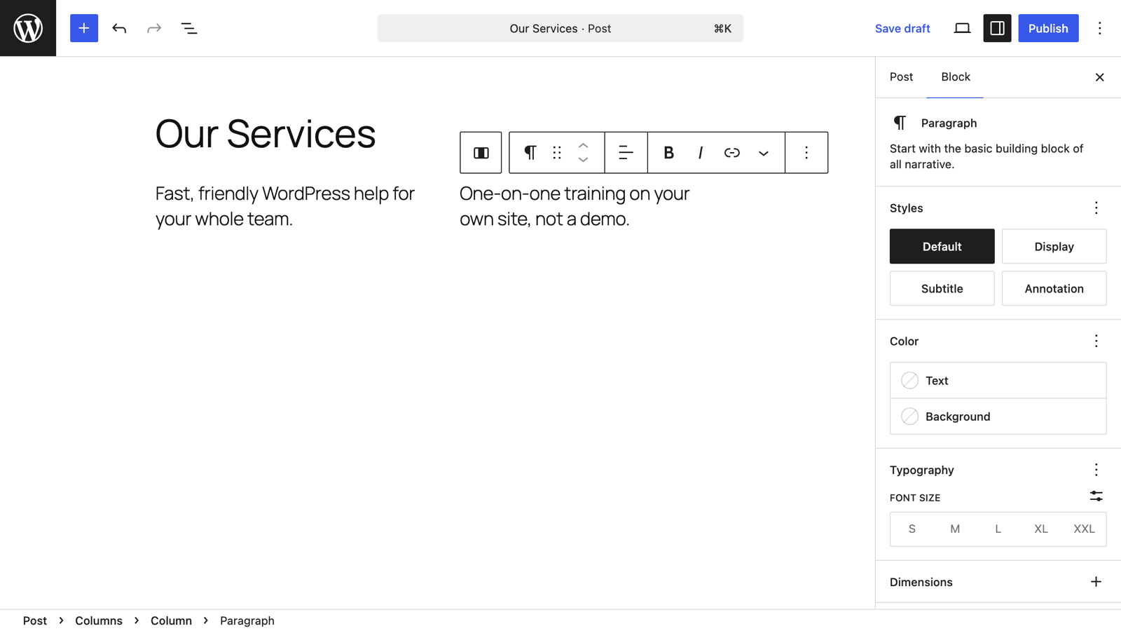
The toolbar above a selected block includes left/right movers, so you can also shuffle a column's position without rebuilding anything.
Click into a single column, then open the settings sidebar (the panel icon in the top-right corner if it's closed). Under Settings → Width, type a value and pick a unit — percentages keep the layout proportional, which is usually what you want. The List View button (three staggered lines, top-left) is the easiest way to select exactly the column you mean.
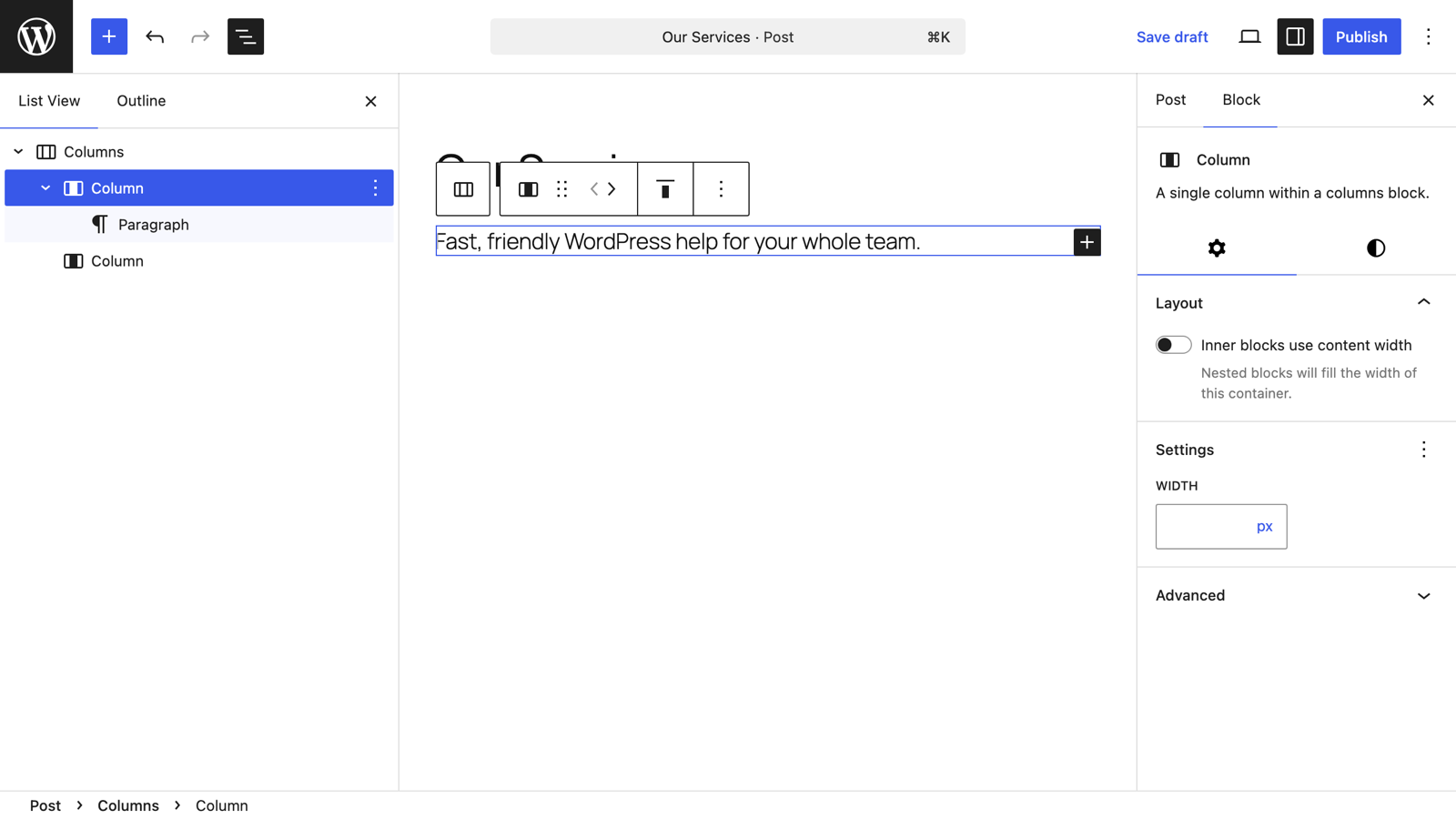
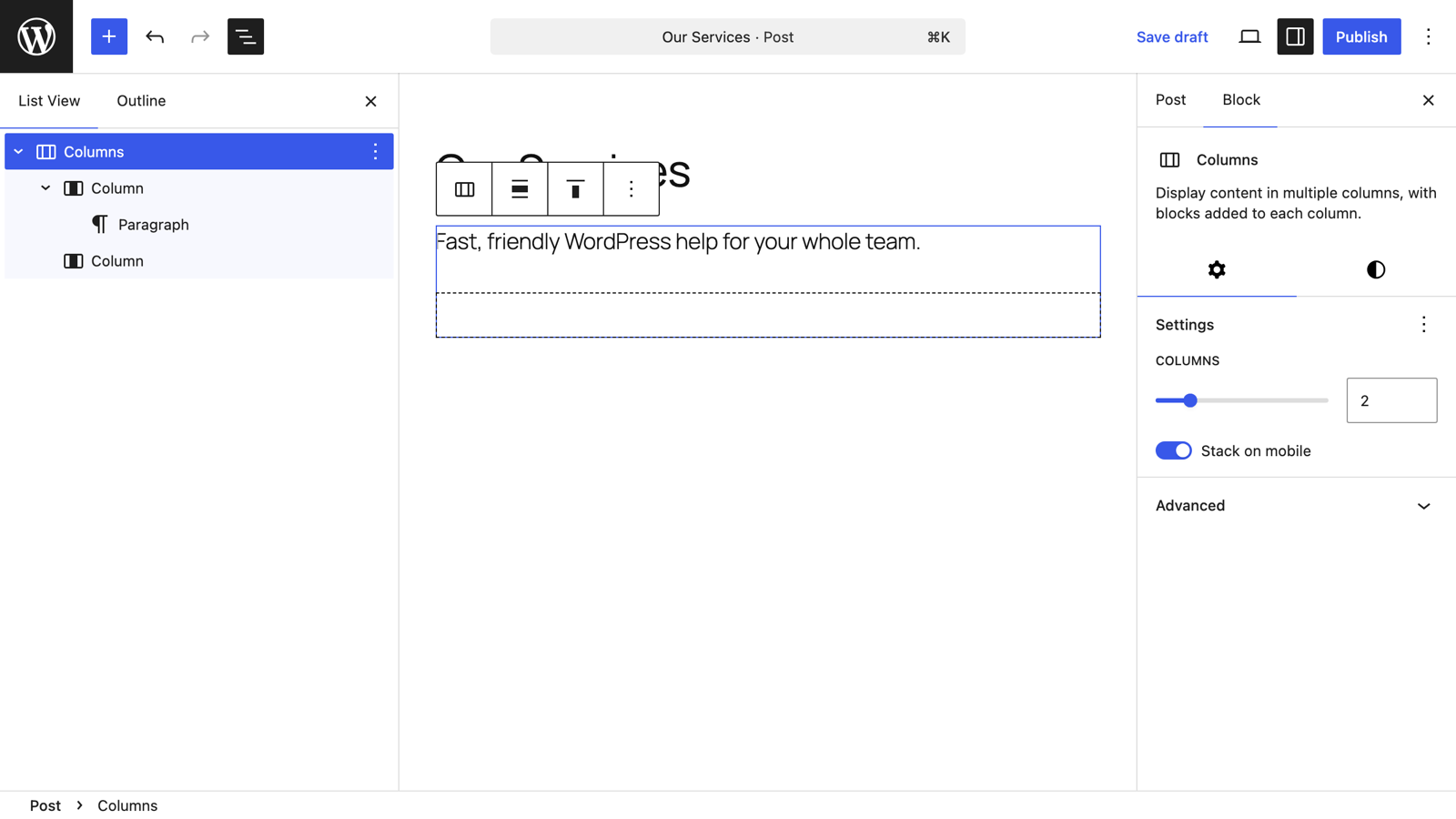
Now select the parent Columns block (easiest via List View, or the breadcrumb at the bottom of the editor). Its sidebar has the two settings that matter most:
- Columns — a slider to add or remove columns (up to six).
- Stack on mobile — on by default; columns collapse into a single stack on narrow screens so nothing gets squeezed unreadable.
With the Columns block selected, the Styles tab (half-circle icon at the top of the sidebar) holds text and background colors plus any style presets your theme provides — an easy way to turn a row of columns into a highlighted band.
When it looks right, click Publish (or Update) and check the live page.
Removing a column or the whole block
Select the column (List View makes this precise), open the three-dot menu in its toolbar, and choose Delete. The remaining columns share the freed space. The same menu on the parent Columns block removes the entire layout.
Columns are the point where many self-taught WordPress users hit their first real layout frustration. If yours won't line up, we untangle exactly this in a one-on-one tutoring session — on your site, not a demo.
Keep learning
- How to use the paragraph block
- Adding a button in Gutenberg
- How to use WordPress block patterns — pre-built multi-column layouts you can insert in one click

Leave a comment