Table of contents
A clear button is the easiest way to move readers to the thing you want them to do next — sign up, download, get in touch. The block editor has a dedicated Buttons block, and it takes about a minute to use well.
Re-shot in August 2026 on WordPress 7.0 — the screenshots match the current editor.
- Insert the Buttons block, type your label, and link it with the toolbar's link icon.
- Fill vs Outline and colors live in the Styles tab of the sidebar.
- Width presets (25–100%) are under Settings.
- One page, one primary button: fewer, clearer calls to action convert better.
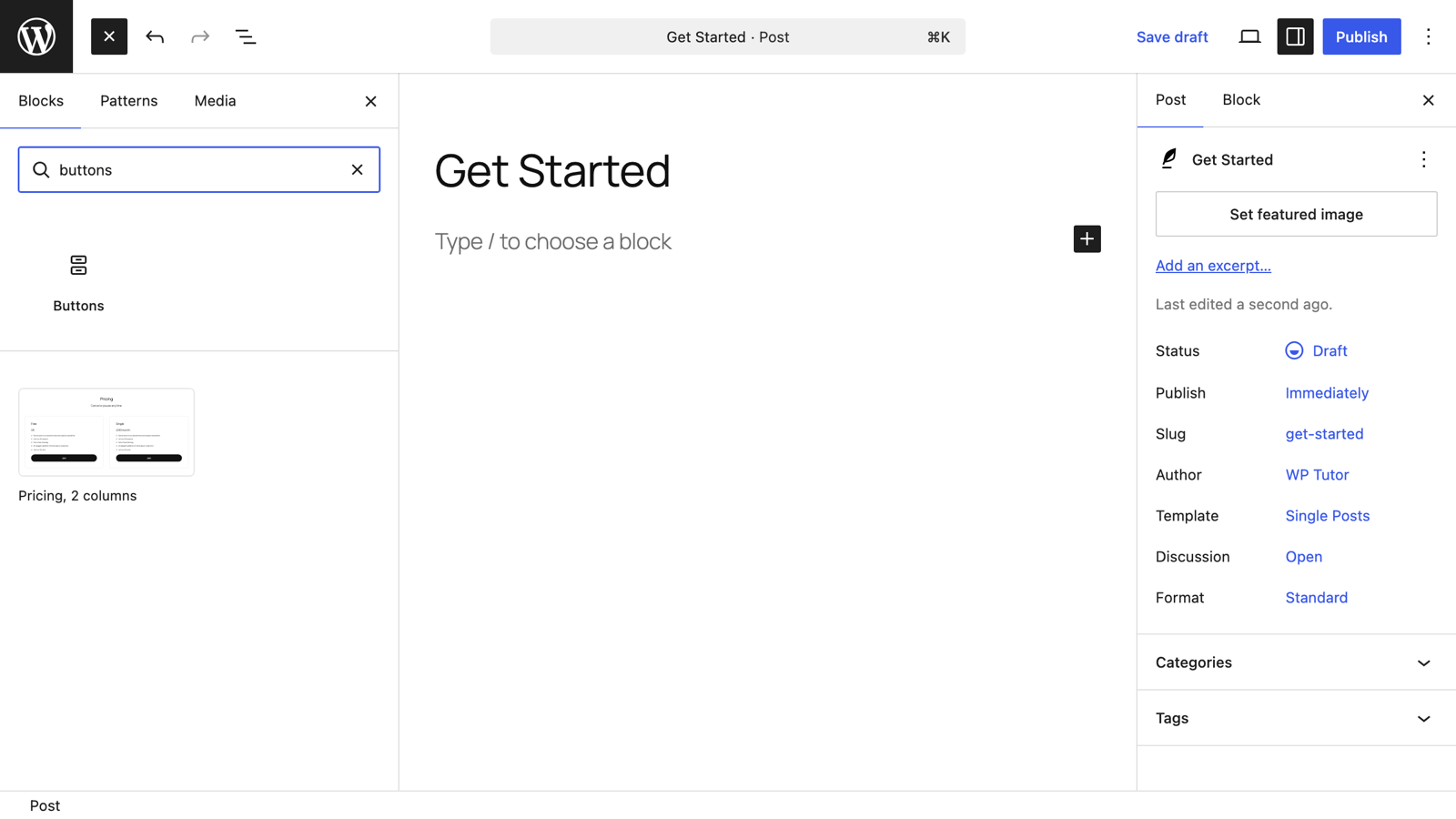
In the editor, click the blue + in the top-left corner, search for buttons, and click the Buttons block. It arrives with one empty button ready for text.
Click inside the button and type what it should say. Keep it short and action-shaped: "Download the Free Manual" beats "Click here."
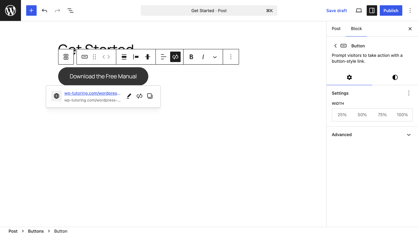
With the button selected, click the link icon in the toolbar, paste or type the destination URL, and press Enter. You can also start typing a page title from your own site and pick it from the suggestions. In the link options you'll find Open in new tab if you need it.
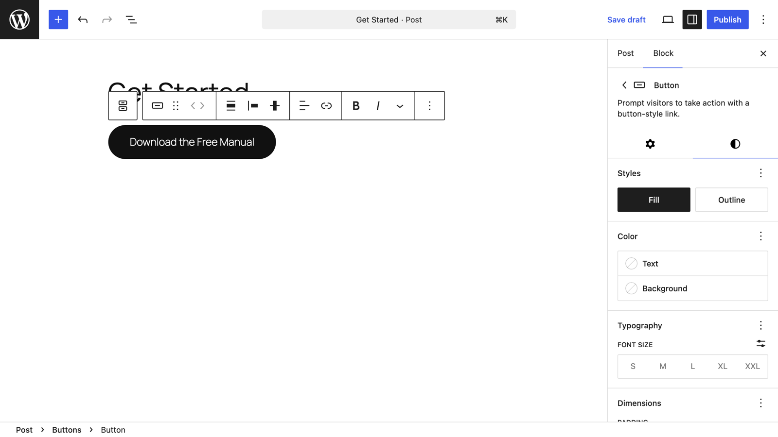
Open the settings sidebar and switch to the Styles tab (the half-circle icon). Here you choose Fill (solid) or Outline, set text and background colors, and adjust typography. Under the Settings tab there's a Width control with 25% / 50% / 75% / 100% presets if you want the button wider than its text.
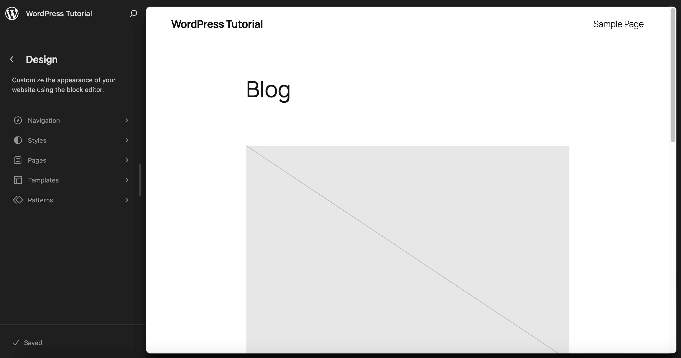
Click Publish (or Update), open the live page, and actually click your button. Thirty seconds of testing catches the classic mistakes — a typo'd URL or a link to a draft page.
To center a button, select the outer Buttons container (not the inner button) and use the justification control in its toolbar — the same control that left- or right-aligns a whole row of buttons.
Keep learning
- Multiple columns in Gutenberg — put buttons beside text or images
- How to use the paragraph block
- How to use WordPress block patterns — ready-made call-to-action layouts

Leave a comment